Flexbox
Flex box布局模型的主要目的是提供更有效率的布局方式,尤其是当容器内元素的尺寸不固定的时候更能表现出它的优势。它能够自动识别子元素的尺寸,从而为盒装模型提供更高的灵活性。
基本概念
如果元素采用Flex进行布局,那么这个元素就可以称为Flex容器(Flex container),元素的所有子元素称为Flex项目(Flex item)。
下图为Flexbox模型图:
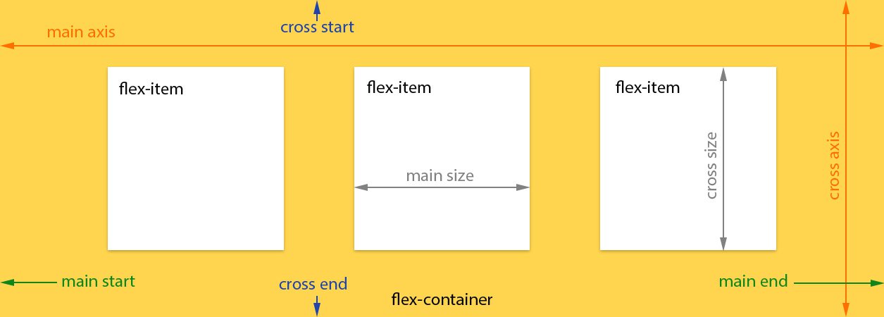
几个术语
- main axis:水平主轴
- main-start:主轴开始位置,与边框的交叉点
- main-end:主轴的结束位置
- cross axis:垂直交叉轴
- cross-start:交叉轴的开始位置
- cross-end:交叉轴的结束位置
- main size:单个项目占据的主轴空间
- cross size:单个项目占据的交叉轴空间
Flexbox容器的构造方法
- 任何一个容器都可以指定为Flexbox布局:
.flex-container { display: flex;}- 行内元素可以指定Flexbox布局:
.flex-container { display: inline-flex;}注意,设为 Flex 布局以后,子元素的float、clear和vertical-align属性将失效。
Flexbox容器特性
flex-direction属性
flex-direction属性决定主轴的方向(即项目的排列方向)。
.flex-container { flex-direction: row | row-reverse | column | column-reverse;}Values
.flex-container { flex-direction: row; /* 默认值 */}主轴为水平方向,起点在左端:

.flex-container { flex-direction: row-reverse;}主轴为水平方向,起点在右端:

.flex-container { flex-direction: column;}主轴为垂直方向,起点在上端:

.flex-container { flex-direction: column-reverse;}主轴为垂直方向,起点在下端:

flex-wrap属性
flex-wrap属性决定内容在抽线上排列不下的换行方式。
.flex-container { flex-wrap: nowrap | wrap | wrap-reverse;}Values
.flex-container { flex-wrap: nowrap; /* 默认 */}
设置不换行。
.flex-container { flex-wrap: wrap;}
设置自动换行,且第一行在上方。
.flex-container { flex-wrap: wrap-reverse;}
设置自动换行,且第一行在下方。
flex-flow属性
flex-flow属性是flex-direction属性和flex-wrap属性的简写形式。
Values:
.flex-container { flex-flow: <flex-direction> || <flex-wrap>;}默认属性值:
.flex-container { flex-flow: row nowrap;}justify-content属性
justify-content属性定义项目在主轴上的对齐方式。
.flex-container { justify-content: flex-start | flex-end | center | space-between | space-around;}Values
.flex-container { justify-content: flex-start;}
左对齐。
.flex-container { justify-content: flex-end;}
右对齐。
.flex-container { justify-content: center;}
居中。
.flex-container { justify-content: space-between;}
两端对齐,项目之间的间隔相等。
.flex-container { justify-content: space-around;}
每个项目两侧的间隔相等。
align-items属性
align-items属性定义项目在交叉轴上的对齐方式。
.flex-container { align-items: align-items: flex-start | flex-end | center | baseline | stretch;}Values
.flex-container { align-items: flex-start;}
交叉轴的起点对齐。
.flex-container { align-items: flex-end;}
交叉轴的终点对齐。
.flex-container { align-items: center;}
交叉轴的中点对齐。
.flex-container { align-items: baseline;}
项目的第一行文字的基线对齐。
.flex-container { align-items: stretch;}
如果项目未设置高度或设为auto,将占满整个容器的高度。
align-content属性
align-content定义了多根轴线的对齐方式。如果项目只有一根轴线,该属性不起作用。
.flex-container { align-content: flex-start | flex-end | center | space-between | space-around | stretch;}Values
.flex-container { align-content: flex-start;}
与交叉轴的起点对齐。
.flex-container { align-content: flex-end;}
与交叉轴的终点对齐。
.flex-container { align-content: center;}
与交叉轴的中点对齐。
.flex-container { align-content: space-between;}
与交叉轴两端对齐,轴线之间的间隔平均分布。
.flex-container { align-content: space-around;}
每根轴线两侧的间隔都相等。
.flex-container { align-content: stretch;}
轴线占满整个交叉轴。
Flexbox项目特性
order属性
order属性定义项目的排列顺序。数值越小,排列越靠前,默认为0。
Values
.flex-item { order: <integer>;}
flex-grow属性
flex-grow属性定义项目的放大比例,默认为0,即如果存在剩余空间,也不放大。
Values
.flex-item { flex-grow: <number>;}
如果所有项目的flex-grow属性都为1,则它们将等分剩余空间(如果有的话)。如果一个项目的flex-grow属性为2,其他项目都为1,则前者占据的剩余空间将比其他项多一倍。
flex-shrink属性
flex-shrink属性定义了项目的缩小比例,默认为1,即如果空间不足,该项目将缩小。
Values
.flex-item { flex-shrink: <number>;}
如果所有项目的flex-shrink属性都为1,当空间不足时,都将等比例缩小。如果一个项目的flex-shrink属性为0,其他项目都为1,则空间不足时,前者不缩小。
负值对该属性无效。
flex-basis属性
flex-basis属性定义了在分配多余空间之前,项目占据的主轴空间(main size)。浏览器根据这个属性,计算主轴是否有多余空间。它的默认值为auto,即项目的本来大小。
Values
.flex-item { flex-basis: auto | <width>;}它可以设为跟width或height属性一样的值(比如350px),则项目将占据固定空间。
flex属性
flex属性是flex-grow, flex-shrink 和 flex-basis的简写,默认值为0 1 auto。后两个属性可选。
Values
.flex-item { flex: none | auto | [ <flex-grow> <flex-shrink>? || <flex-basis> ];}align-self属性
align-self属性允许单个项目有与其他项目不一样的对齐方式,可覆盖align-items属性。默认值为auto,表示继承父元素的align-items属性,如果没有父元素,则等同于stretch。
Values
.flex-item { align-self: auto | flex-start | flex-end | center | baseline | stretch;}参考资料
- https://www.w3.org/html/ig/zh/css-flex-1/#intro
- http://www.ruanyifeng.com/blog/2015/07/flex-grammar.html)
- https://scotch.io/tutorials/a-visual-guide-to-css3-flexbox-properties
- https://css-tricks.com/snippets/css/a-guide-to-flexbox/
- https://developer.mozilla.org/zh-CN/docs/Learn/CSS/CSS_layout/Flexbox